

Developed together with the design team from at Fundação Bienal de São Paulo, the 31st Bienal de São Paulo’s visual identity is based on a commissioned drawing and a typographic frame.
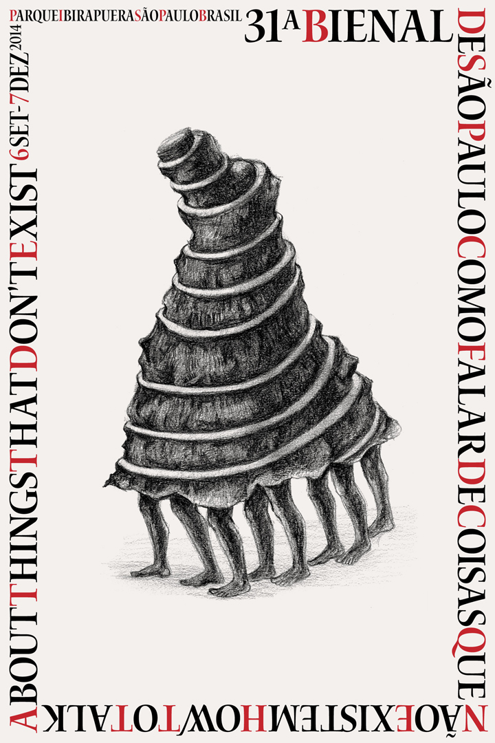
The process for developing this identity was intensified through a work of exchange and analysis of images. Gradually a set of images stood out: spirals and knots reappeared over and over as well as other intricate forms including organic figures emerging from pre-modern societies. Needing a further step and something tailor-made for developing these ideas, the team invited Prabhakar Pachpute to compose a unique image. The resulting drawing responded to the early ideas looks like an impossible conglomeration of bodies inside a Tower of Babel structure. The fantastical aspect of this figure, which also recalls a many-legged organism, depicts an imagined collectivity and the mental and physical transformation crucial to the curatorial approach of this Bienal. Being mobile, it stresses the urge to come together and walk in common towards an uncertain destination.
In the poster, the drawn image is framed by a calligraphic type that suggests handmade manufacture. This sets the tone for an intimacy in the relations between art, mediation and audiences that we are aiming for in the 31st Bienal. It uses a typeface based on the work of English calligrapher Julian Waters and other applications adopt Arrus typeface, by Richard Lipton. The overall composition follows the canvas limits as guidelines, its awkwardness affirming the central role of typography in the visual identification. Within this composition, colour appears punctually, highlighting some words according to the needs of the communication.

